Morgan Stanley Docs Redesign
Documentation Home for Campfire, Morgan Stanley
Role
Design Lead
Scope & Timeframe
Competitive analysis of other company’s systems sites, content writing, visual exploration, responsive breakpoint mock ups, animation, and specs for developer hand off.
4 months, from design to developer hand off.
Stakeholders
Director of COE, Designer Systems manager, and Content Design manager.
Before
The campfire.design site was designed originally for E*TRADE’s Design Language pre-acquisition and became outdated as the system grew.
The site needed a new home page to reflect the current expansive offerings and the Campfire look and feel.
Built using system colors, typography and components where possible.
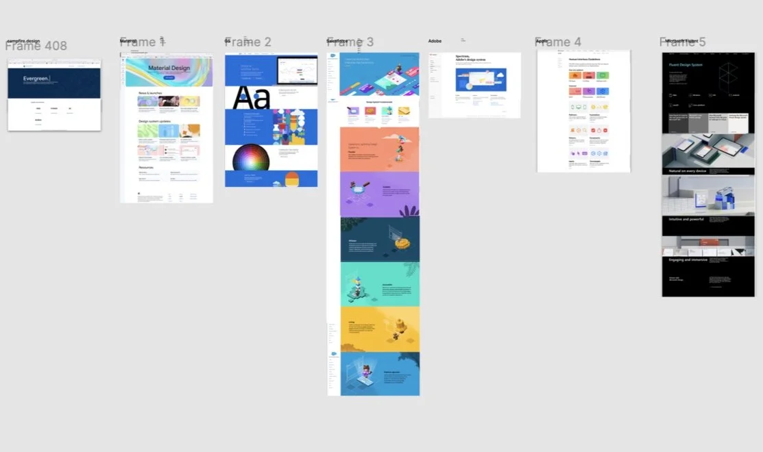
Understanding how other public system documentation is presented
Before beginning design I spent time on a competitive analysis of public facing design systems.
Exploration
I explored minimalist options, bold graphic options, the possibility of highlighting hand drawn illustrations done by team members, and many more.
Many wireframes, design reviews and prototypes later we landed on the right approach (see below).
Final design
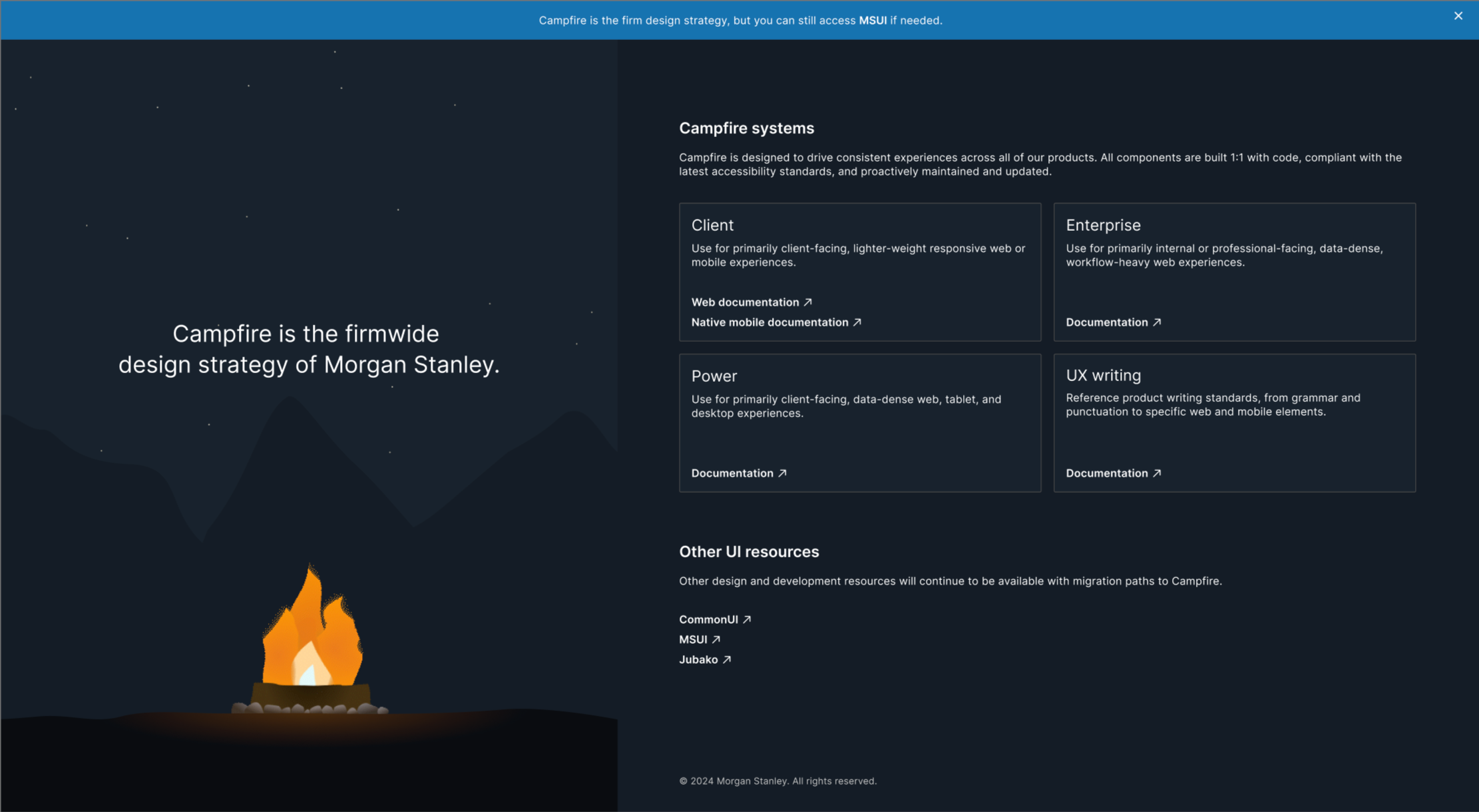
After many iterations of potential visual directions the team of stakeholders and I landed on our approach.
The final design ended was chosen because it felt true to the feeling of the word “Campfire”, with simple powerful visuals, while also maintaining a clear brand relation to Morgan Stanley.
The animated fire and stars add an element of whimsy (see live animation below).
Responsive layout
I designed at all breakpoints to ensure that content reflowed seamlessly and nothing would break.
Animation
I created an animated flame to bring the name of the system, Campfire, to life.
I also animated stars in the night sky, with occasional shooting stars for those who happen to catch them for a moment of delight.


